> ## Documentation Index
> Fetch the complete documentation index at: https://docs.neopal.ai/llms.txt
> Use this file to discover all available pages before exploring further.
# Appearance
> The Appearance settings allow you to customize the look and feel of the AI Chat Widget on your storefront, so it matches your brand and enhances the user experience.
 ### Enable the Widget
To display the NeoPal Chat Widget on your storefront, you need to enable it via the **Theme Editor** in your **Shopify Admin**.
### Enable the Widget
To display the NeoPal Chat Widget on your storefront, you need to enable it via the **Theme Editor** in your **Shopify Admin**.
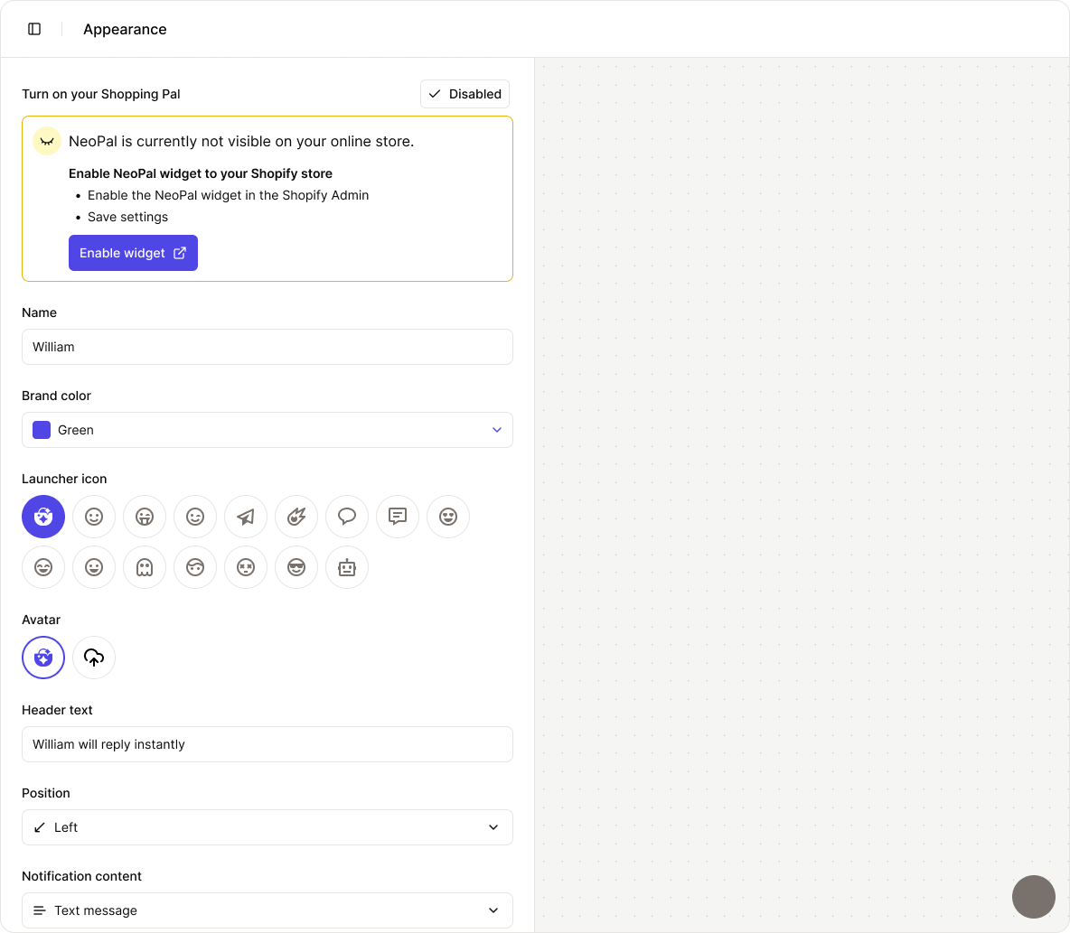
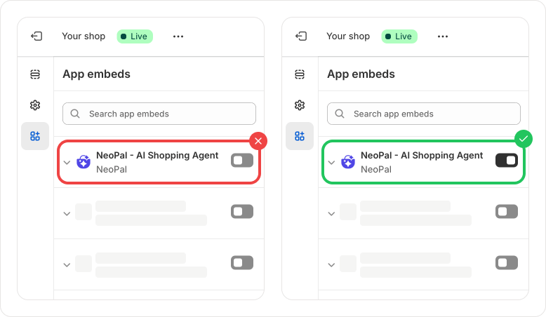 If the widget is turned off, the chat window will not appear on your storefront, and you’ll see a notification like this:
 ### AI Agent Name
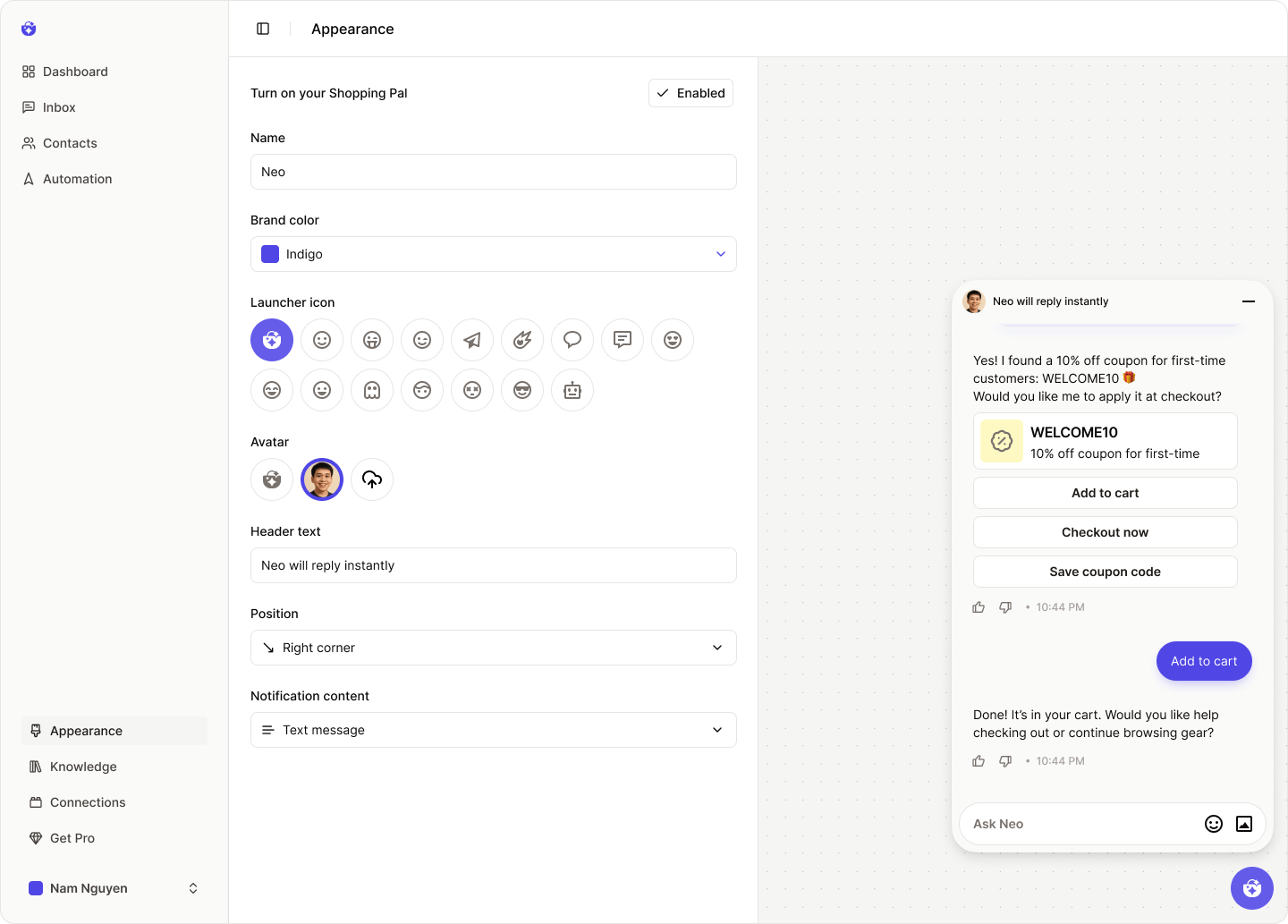
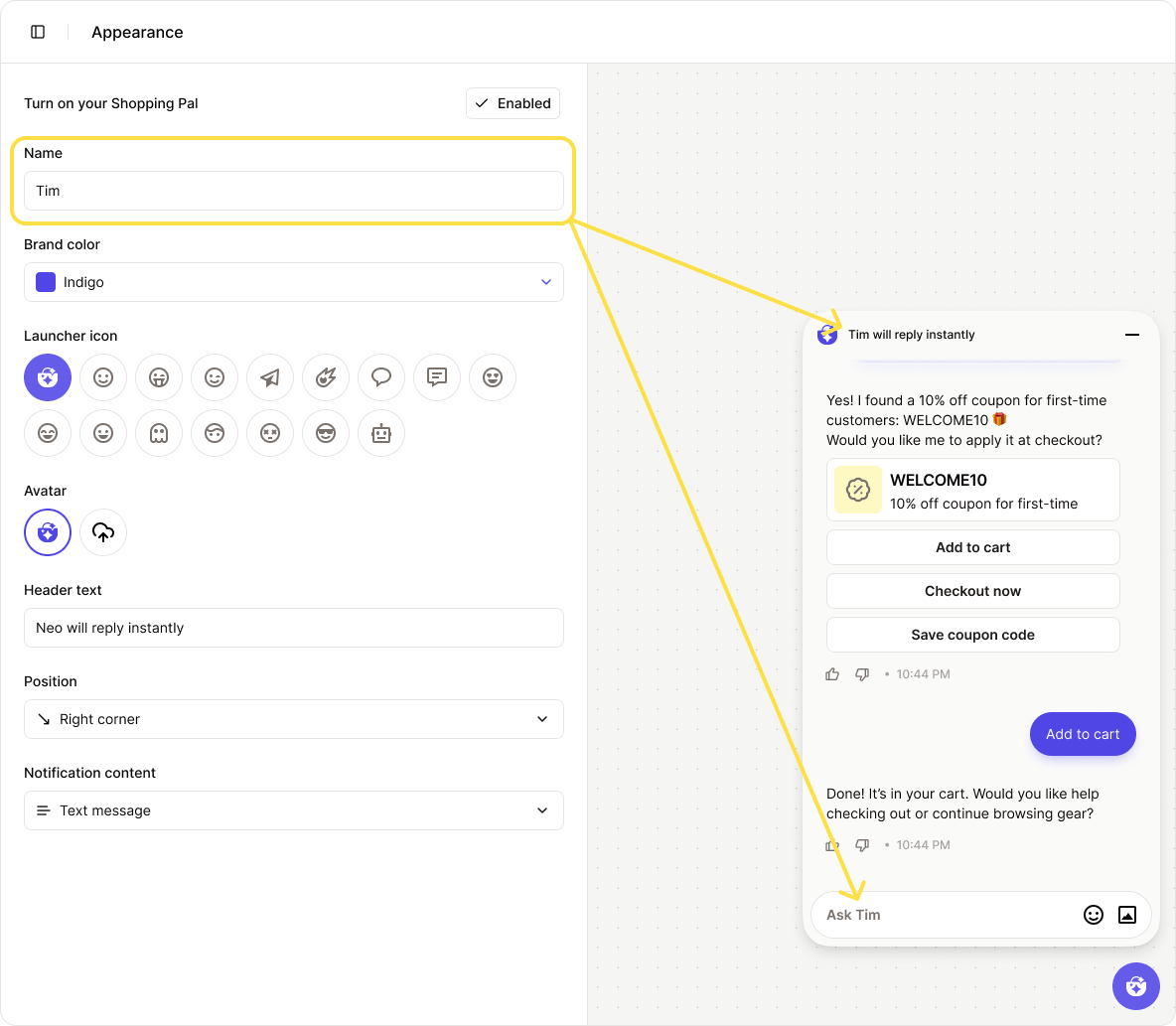
By default, your AI Agent is named **Neo**.
You can change this name to better match your brand voice or persona.
### AI Agent Name
By default, your AI Agent is named **Neo**.
You can change this name to better match your brand voice or persona.
 ### Launcher Icon
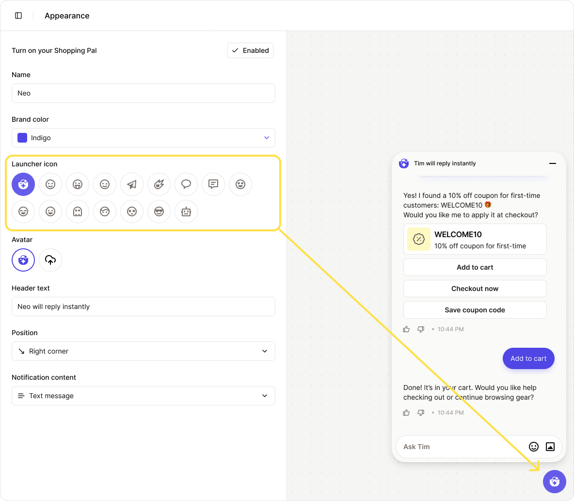
The **Launcher Icon** is the small icon shown inside the widget’s launch button.
You can upload a custom image that reflects your brand identity.
### Launcher Icon
The **Launcher Icon** is the small icon shown inside the widget’s launch button.
You can upload a custom image that reflects your brand identity.
 ### Avatar
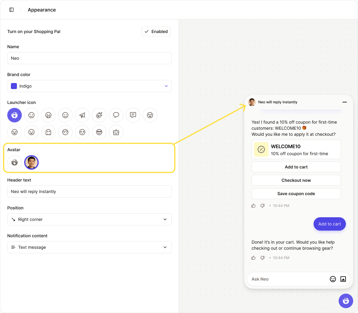
The **Avatar** appears at the top of the chat window, giving users a visual sense of who they’re talking to.
By default, it matches the launcher icon, but you can upload a separate image.
The avatar is displayed in a circular frame. To ensure it looks good, upload a **square image** with a file size under **1MB**.
### Avatar
The **Avatar** appears at the top of the chat window, giving users a visual sense of who they’re talking to.
By default, it matches the launcher icon, but you can upload a separate image.
The avatar is displayed in a circular frame. To ensure it looks good, upload a **square image** with a file size under **1MB**.
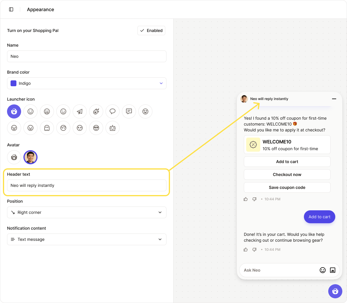
 ### Header Text
This is the line of text displayed in the widget’s header.
You can customize it to show a hotline number, a promotional message, or a friendly greeting — whatever fits your needs.
### Header Text
This is the line of text displayed in the widget’s header.
You can customize it to show a hotline number, a promotional message, or a friendly greeting — whatever fits your needs.
 ### Widget Position
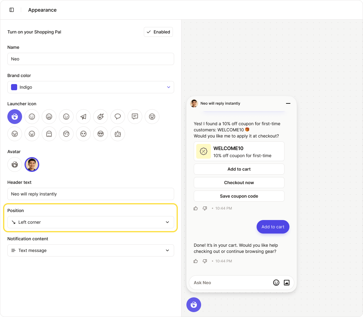
Choose where the widget appears on your website. There are three position options:
1. **Bottom right corner** (default)
2. **Bottom center**
3. **Bottom left corner**
### Widget Position
Choose where the widget appears on your website. There are three position options:
1. **Bottom right corner** (default)
2. **Bottom center**
3. **Bottom left corner**
 **Notification Content**
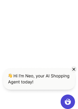
When a message is sent but the chat window hasn’t been opened, it will appear as a **notification preview**.
Customers can choose to open the message or dismiss the notification.
**Notification Content**
When a message is sent but the chat window hasn’t been opened, it will appear as a **notification preview**.
Customers can choose to open the message or dismiss the notification.
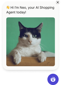
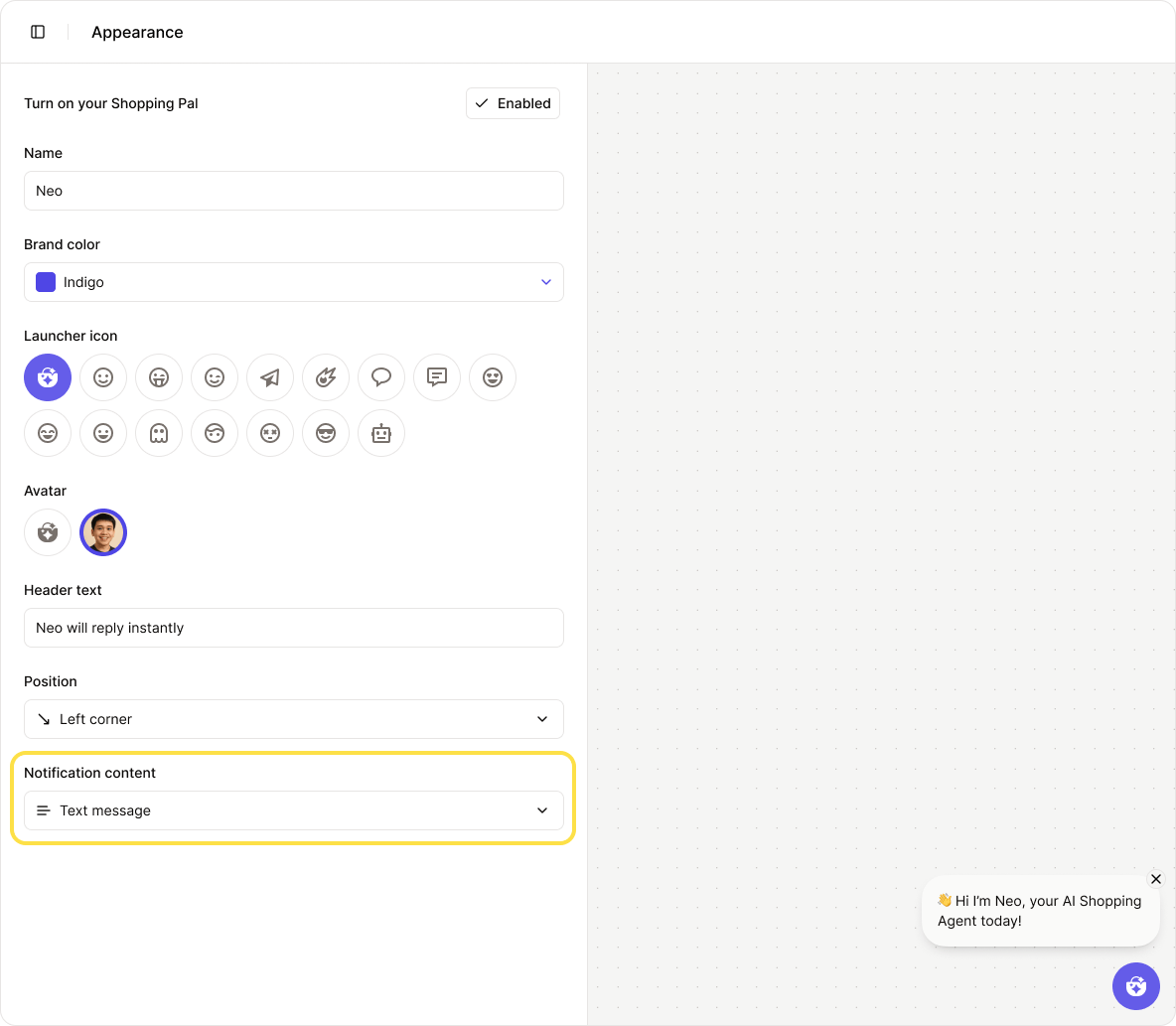 You can customize the notification content to show either **text only** or the **full message**, including images, product cards, discount codes, and more.